
I loved working on this project. It was the culmination of the experiences that I’d learned from during my time at the Habanero Consulting Group. I had worked on a huge range of types of products - from intranets to external websites and desktop applications, for a tonne of types different clients—including video gaming companies, government agencies and subsidiaries, school districts, hoteliers, and a whole bunch more. User experience design was an integral component to every project that came to Habanero and the design team was involved with projects from initial engagement and discovery through to maintenance of a “completed” project.
The Vancouver Airport Authority was looking to update their website in preparation for the 2010 Olympic Games, knowing that traffic in and out of the facility would increase and that people would be expecting more from the online resource than was previously available.
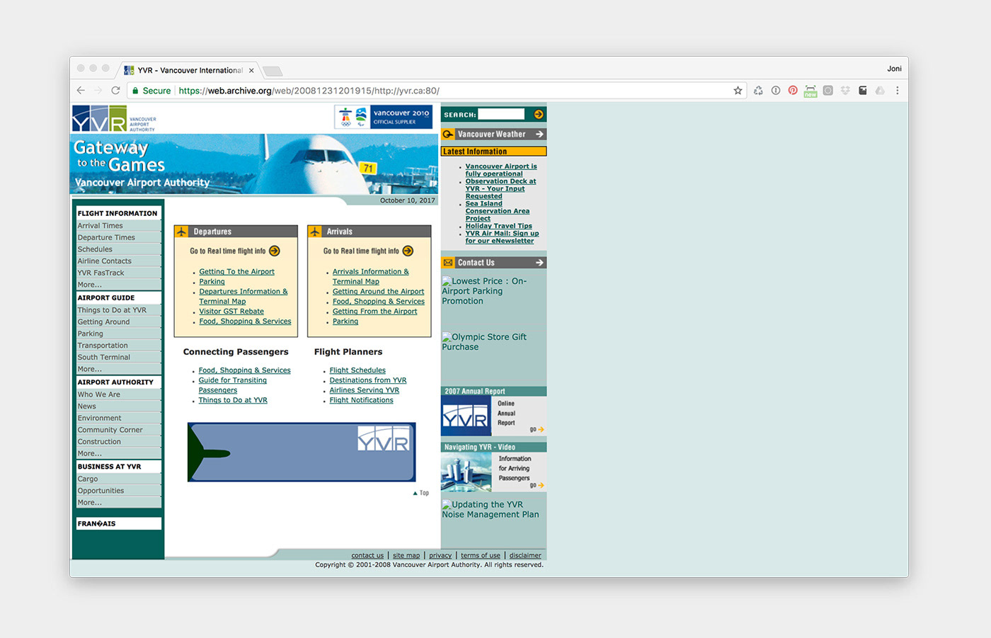
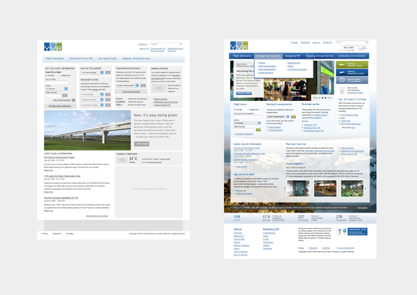
The previous version of the Vancouver Airport Authority website.
The long held notion by high-level decision makers at the airport was that a website was an extension of the marketing department—effectively an enhanced brochure. New team members, as well those who had been working there for a long time, understood that the website could indeed more than that and wanted to see it become a tool for realizing the mission of “moving people and bags”. Despite a relatively limited budget, we took on the project understanding that it could become a flagship piece, and lead to a long-term relationship with a desirable client.
The initial project phase was a balance of learning about users’ needs before, during, and after a visit to the airport and communicating these findings back to decision makers to help them understand and support the move to provide a more comprehensive web experience. The outcome of the research and the approach to communicating user needs to stakeholders took the form of an in-person presentation, walking through a specific scenario showing sketches of potential touch points and forward-thinking solutions, which we knew we may not be able to build in the first phase, but which could act as a method of getting the client to get excited about possibilities.
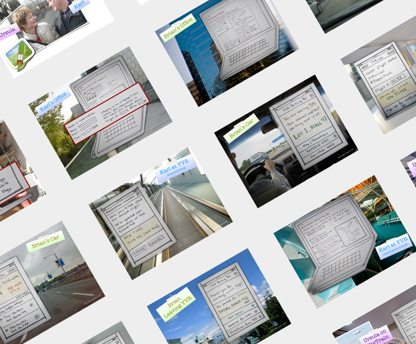
Concept presentation using sketches.
The presentation was a resounding success, and we were off to the races. Continuing our research into user behaviours and needs, we dug into site analytics to see what people needed and how they were finding it. Not surprisingly, we found that a growing number of users were visiting the website using their mobile devices. As a result, I was determined to include key content for users who were visiting the website. This project was taking place at an interesting time—we knew that users were accessing content on their mobile devices and that they would increasingly continue to do so, but the concepts of “mobile first” and responsive design wouldn’t begin to become obvious until about a year after launch.
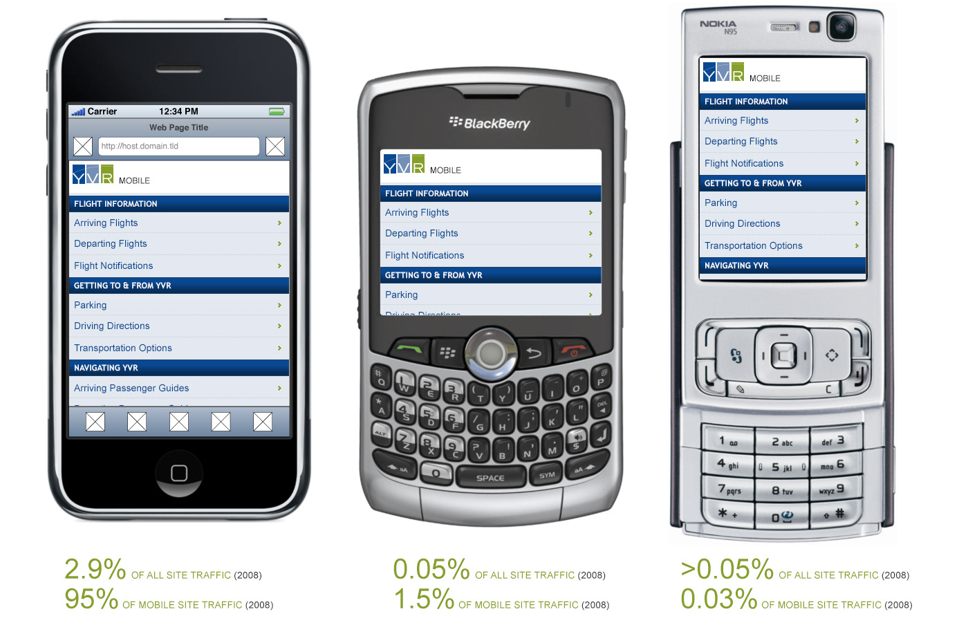
Site traffic stats from 2008, with mock-ups showing intended design for mobile devices.
We also we able to delve more fully into the kinds of things that people wanted from the website: how to get to and from the airport, where to park, where to eat and shop, and how to find a gate, when flights would be arriving and departing, to name a few. We needed to establish a strong, clear information architecture, upon which we could build from existing content. Content auditing, analytics review and card-sorting exercises with internal subject matter experts and users were our primary methods for getting to a solid site structure.
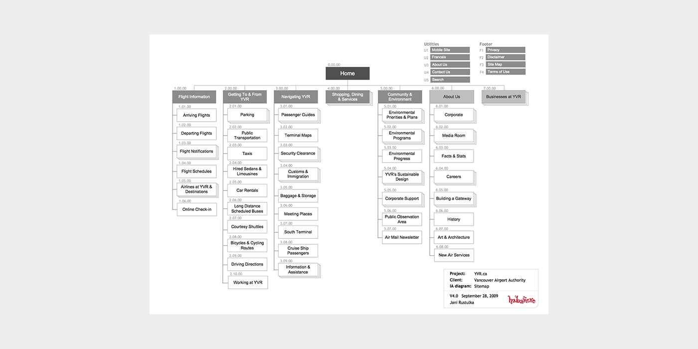
The high-level site map for yvr.ca. Not shown, the detailed sitemap and content audit spreadsheet - the real workhorse of getting the information architecture dialed.
From previous experience on projects at Habanero, we had found that often it proved difficult to usability test on wireframes, and as such after approval from the client team on the site structure, we moved directly into wireframing and visual design.
A late-stage wireframe and a mock-up of the homepage.
Once the visual design direction was approved by the client, we moved to cranking out more mock-ups and usability testing, making changes to the design based on our findings. I worked closely with a junior designer at this point, establishing the direction and getting his help to work through more than 60 comps. As we began to implement the website, I worked very closely with 2 front-end engineers and client-team specialists to make sure that the intent was translated as closely as possible.
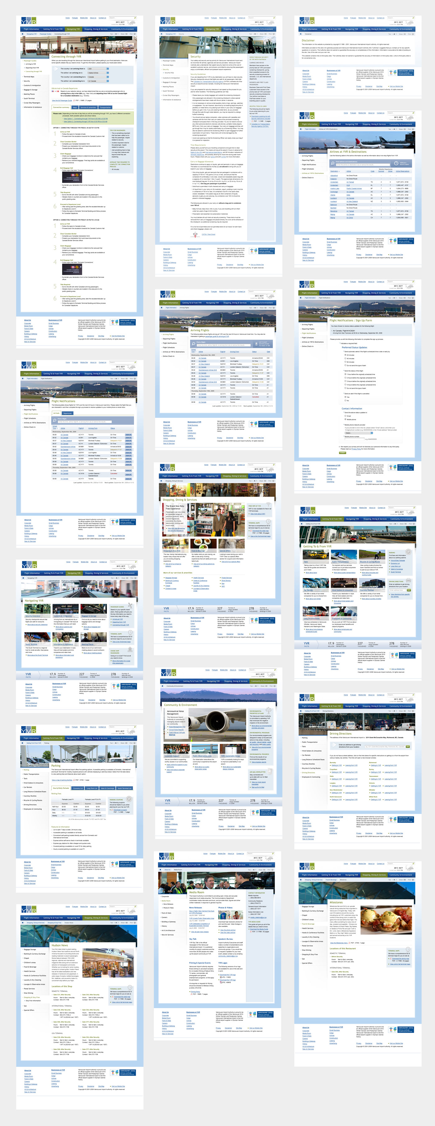
A wide range of mock-ups created for the site.